One of the driving questions of a proximate bible asks how technologies shape the way humans make meaning. More specifically, I am curious about the impact of reading (and writing) interfaces on our capacity for meaning making, particularly with respect to cultural icons of reading/writing such as bible. I begin with the hypotheses that
- medium matters at least as much in making meaning as the content it ‘bears’ and that
- all new media are palimpsestuous translations of their predecessors, such that new media carry the marks of the old, even if partially erased.
So, the material media translations of the reading interface of bible from scroll to codex to print to internet to mobile, all participate in creating the meaning potential of bible and its characters.
This play on words of ‘bible and its characters,’ connoting the ambiguity of both the alphabetic characters and the narrative characters of bible, comes from a comment Levinas makes about bible in Ethics and Infinity, p. 23.
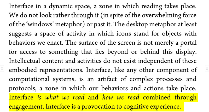
 The materiality of interface matters a great deal, which is why I have chosen to develop the components of a proximate bible with a touch screen mobile interface in mind. In fact, I do /98% of the development and composition of a proximate bible using a touch screen tablet (iPad Air), augmented by an older touch technology, a keyboard. I find touch screen devices like the iPhone and iPad suggestive of interface as performative space. In her essay, ‘Humanities Approaches to Interface Theory’, Johanna Drucker helpfully offers a view of interface as more of a theatre than a window (Drucker, ’Interface Theory’, 9).
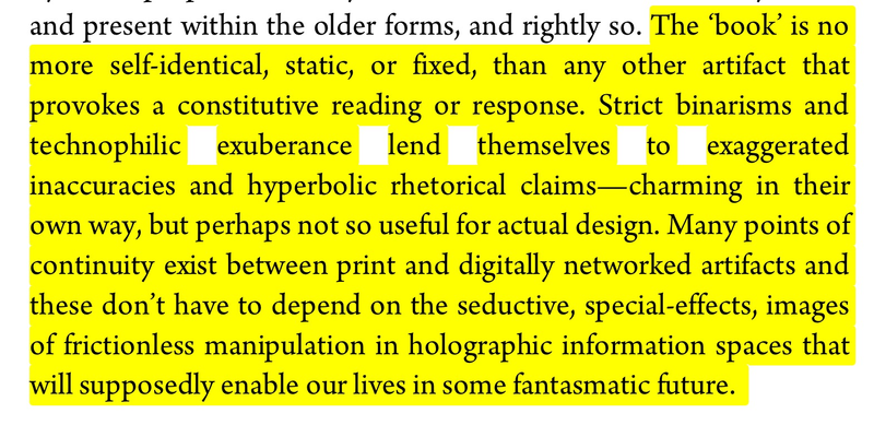
 ’Interface is what we read and how we read combined through engagement.’ Before I had encountered Drucker’s work, this question of the relationship between how we read and what we read drove my desire to explore bible as media (see what’s in a title? for more). In this performative notion of interface, Drucker is asking us to question our tendency to separate material processes of engagement from content engaged. She also helpfully reminds us that this material entanglement of content and process is not new to this ‘new media’ age (Drucker, ‘Interface Theory’, 18).
 By ‘book’ here, I think she means codex, such that even the ancient technologies of codex or scroll were spaces of engagement, not mere vehicles of content delivery. Yet, as stated in my hypotheses above and mentioned by Drucker here, each medium or interface is a palimpsest of those before it and content does not make meaning apart from the engagement of interface. This is precisely why it is important to explore the relationships between the interfaces of bible throughout its cultural history and how these transitions and translations will shape its capacity for meaning.
This question of bible and medium, ancient and future, remains pressing today as indicated by the New York Times reporting on a recent find of a papyrus fragment containing some New Testament text.
Thanks to @peisenbaum for pointing this out - https://t.co/wcq9j4d9bk . raising questions about new media in antiquity and today. #aproxibib
— Michael Hemenway (@textpotential) December 6, 2015
This article does a fantastic job exploring the curiosities about interface related to bible book technologies and the internet marketplace that enabled this find. Why does it matter if this is an old and rare example of christian bible on scroll instead of codex? Because material medium matters as much as the text it performs, ‘interface is information, not merely a means of access to it’ (Drucker, ‘Interface Theory,’ 10).
Even at the level of design of this a proximate bible space, I am hoping to practice the enduring importance of the materiality of interface as a space of engagement. The default settings of the theme I use for this site did not allow touch screen users to double tap or pinch zoom on a particular area of the screen. I understand the design sensibilities of controlling the layout of a page to limit the user impact on its aesthetics. Yet, given my propensity in my own work to focus on and gather small fragments from different sources, I want users to have the ability to zoom in on an image or a phrase to read more closely and to share more specifically. In fact, allowing users to shape the interface in these ways with touch highlights the engagement that constitutes interface for Drucker and also materially illustrates the entanglement of strategies (structures) and tactics (uses) in the everyday practice of reading.
See troubling poiesis for a discussion of de Certeau’s everyday practice as it relates to a proximate bible.
In order to stabilize the frame of the interface for my default theme (gridly for postach.io), while still enabling a kind of responsive design that would adapt to different screen sizes on devices, the developers combined a prohibitive viewport meta tag with a set of CSS media queries for different screen sizes.
In the ‘viewport’ language here, we again see the pervasive notion of interface as window that Drucker helps problematize above. Perhaps allowing user interaction to actually shape this ‘portal for viewing’ challenges the static notion of screen?
The default viewport meta tag looked like this:
    <meta name="viewport" content="width=device-width,
    initial-scale=1.0, minimum-scale=1.0, maximum-scale=1.0">
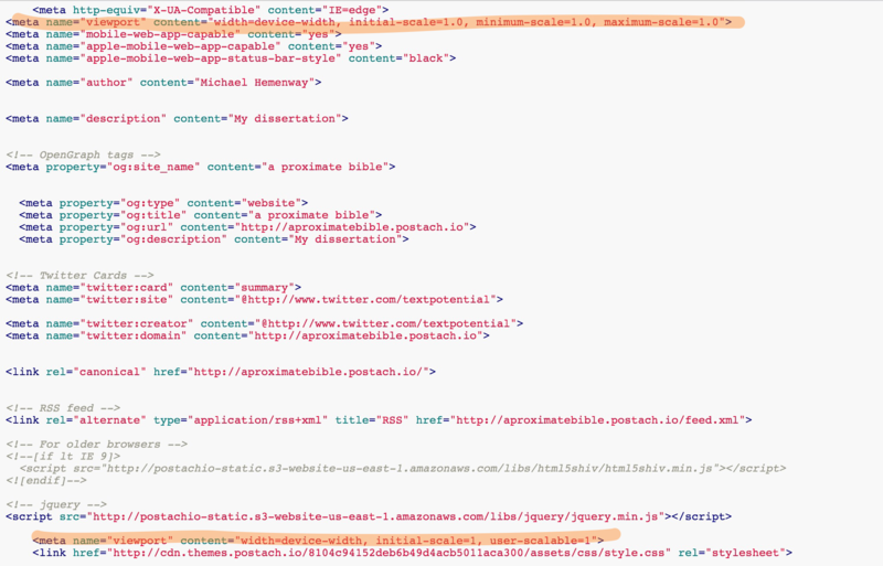
The explicitly stated minimum and maximum scales of 1.0 in this viewport tag prevent all user zooming capabilities and fix the frame of the page. Though postach.io uses github forks to allow users to palimpsestuously customize themes, this particular viewport meta tag is embedded in a site variable that is not modifiable at the theme level. Given the linear nature of HTML processing, I was able to reset these viewport settings by restating the viewport meta tag farther down in the HTML of the page. Repeating the meta tag is far from elegant, but it addresses the need within the limits of the canvas upon which I have chosen to work and it provides an example of the incomplete erasure of palimpsest in a digital environment. These two lines of code in my theme
 get expressed as the following in the actual HTML of the page when it renders in the a proximate bible site
 In this expansion, you can see all the work the `` variable is doing and the blatant erasure of the first viewport settings by the second, while not actually removing the code. Replacing the minimum and maximum scales with user-scalable=1, enables the user to double tap and pinch zoom to interact with the reading interface and shape the frame of engagement. In a small but significant way, this second viewport meta tag provides a material enactment of de Certeau and Drucker in the entanglement of strategies (
initial-scale=1) and tactics (user-scalable=1) of the interface that is reading.
Reading has always been a participatory and material performance as suggested by Harry Gamble’s wonderful analysis of early Christian reading practices in Books and Readers in the Early Church: A History of Early Christian Texts. How might the materiality of this zoomable interface shape the performance of reading? What could the affordances of a user defined frame and the capacity to isolate a small fragment do to the operations of authorial intent and sustained narrative in either a dissertation or a bible? Is it possible that proximity in Levinas and performance in Drucker both suggest a kind of interface that demands contact without grasp, an infinite poiesis characterized by an ongoing process of struggle between strategies and tactics?